Campaign Photography
Campaign photography is pictures that makes awareness to people.
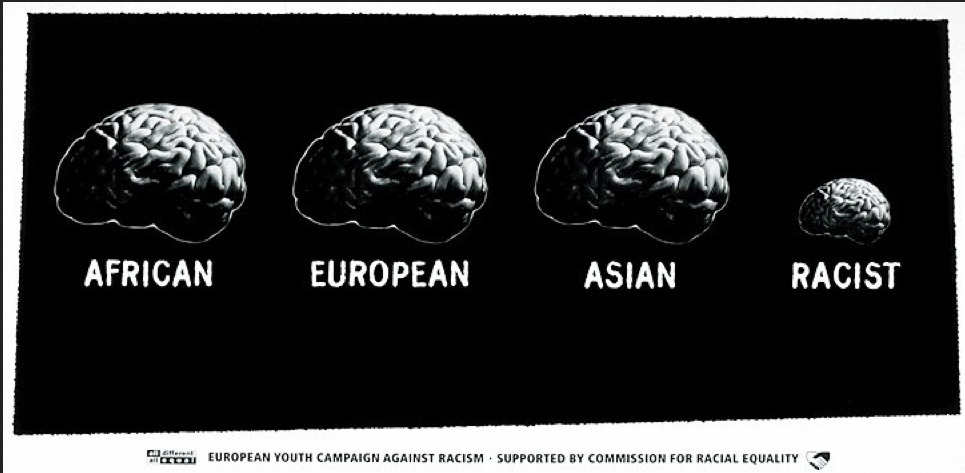
First of all I personally like this picture, because I am against Racism and I believe everyone is equal, no one is perfect. In this picture it is trying to say Africans, European and Asians people are the same and that racist people are different, which is true. Basically the picture is trying to say "The different races are all the same just a different colour". It is not under exposed or over exposed just perfect. It is a big depth of field and the focus point is clear, which is good because it should be big and clear soo people can see how this is a important message and this should make people aware about racism. Rule of thirds is kind of used but more like rule of fours because instead of being split into three sectors it is in 4 however it looks good the way it is. It is in worms eye view, showing the whole platform. The lay out, I would say is good, the background is black which makes it look serious and not something happy with all colourful colours everywhere.
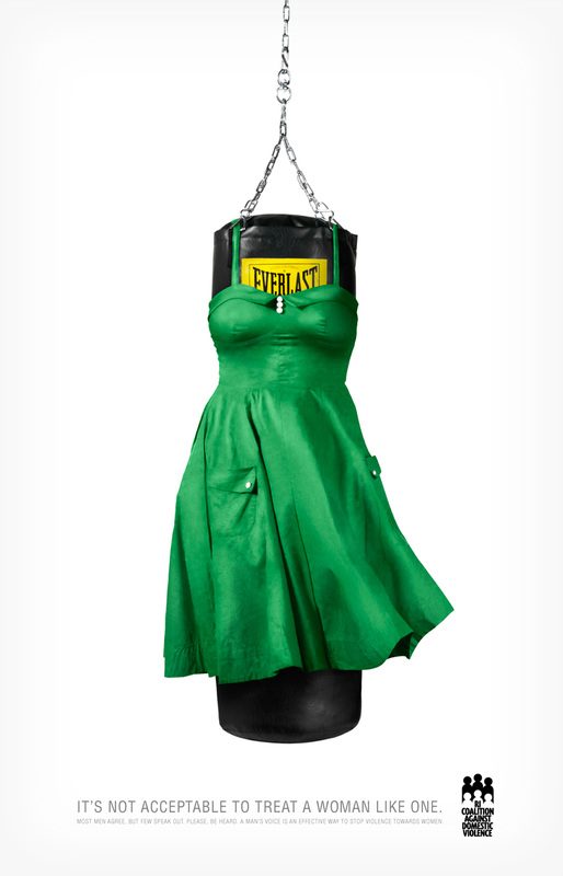
There is women beaters everywhere, and this picture will probably change their ways when they see this picture. The quote "Its not acceptable to treat a woman like one" suites the picture. This picture was taken in the studio with a white background, it is not overexposed or underexposed. The depth of field is large, everything is focused and is clear. The layout of the picture is good, the background is plain white, without any colourful colours which is good, because if there was colourful colours they picture wouldn't look serious and people wouldn't look important. The dress on the boxing bag showing that the boxing bag is the lady is quite clever and true. But it should have been both male and female, because people think men could look after themselves but some men don't want to tell someone because they might get called names for getting him by a lady and laugh, ladies sometimes have a advantage because they are females, and people think men can look after themselves and are stronger. I also like it how it is in the middle it stands out, using the rule of thirds, splitting the picture in three sectors. It is in worms eye view, showing the whole platform. It shows a very important message. The sizes of the props used are suitable sizes.
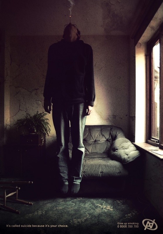
If I was a smoker I would stop straight away, because this picture is true but quite scary. "Its called suicide, because its your choice." This is very persuading and I hope people are aware about smoking kills and its their choice. The picture is not overexposed or underexposed, the colours are quite dark and there is lots of shadow which makes the picture look dark, dark things are always something negative. The depth of field is large, which is good, everything is focused and is clear. The room looks dirty and abandoned, probably because the person that lives there doesn't care about it or anything in example smoking when he knows smoking kills he still does it, he also uses the lighting from the window to show shadows, the layout is good and makes it look like it is not a good situation, secondary colours. The photography used the rule of thirds, to split the picture in three sectors, the middle the most important and the two sides to show this atmosphere and how bad it is, the background and layout is good and appropriate. This photographer is very clever, the way he put the man in the air smoking a cigarette looking like he is hanged smoking a cigarette. He edited the picture and making it look like he is actually in the air. This is a very important and standing out picture and should be on cigarette packets which will show a important message. The sizes of the props used are suitable sizes.
For my Shoot
All my shoots will be negative, because I think that people must be aware about it and it is important, in example:
1.Bullying
2.Abuse
3.Racism
etc...
Shoot 1
In this shoot the story is that the person in the white shirt is bullying the victim with the blue blazer.


My Worst Picture

I picked this for my worst picture, because first of all the picture is out of focus, and the arms shouldn't be crossed it should be trying to stop the bully from pushing and victimizing him.

I picked this picture for my best picture. The camera has not properly focused on the face, with no depth of field because nothing is focused and is blurry everywhere. Next time I will make sure it is focused before I capture the picture. However the picture is not overexposed or underexposed. The victim expresses the situation with his facial expression and it will make people aware about it and they would think how they would feel if they were in that situation. A caption with this would look better and I will make one saying "Does it make you look bigger making someone feel smaller?" The composition is good, it is clear that it has been taken in the toilet, this is where bullying is more likely to happen. The way the victim is putting his hands back makes it look like he is trying to stop the bully from hurting/abusing him. The rule of thirds has been used, separating the picture in the sectors.
The picture with the caption."Does it make you look bigger making someone feel smaller?"
My Best Picture
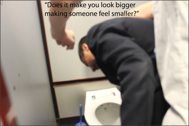
I think that the quote "Does it make you feel bigger making someone feel smaller?" is good and makes the picture better. First of all the bully feels bigger and the victims feels smaller and not noticed. Which makes them feel unhappy and lonely. This picture is important to make people (mostly bullies) aware that making people feel bad and unhappy is not good and hurts their feelings.
Shoot 2


Worst picture

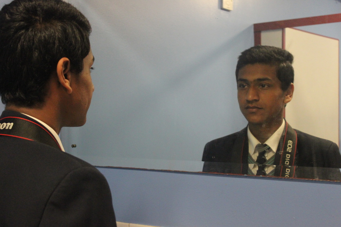
I picked this picture as my worst, because I should have captured a reflection of his face in the mirror. It doesn't make sense right now because its just a picture of a person in front of a mirror not showing his full face expressions.
If I used face paint to put a bruise on his eye I could take the photograph again then on Photoshop I could edit it and on the left side a normal smiley face and then on the reflection side the right side a emotional face, with a caption saying "You know my face but not my emotions." If I did that then it would be a very important picture and will make people aware and make them more kinder and ask people if they are actually okay, and then people would be more peaceful.
My Best Picture
I picked this picture for my best picture, because it stands out and makes people aware and think what this picture actually is about. I will use Photoshop to make a caption and make the picture make sense, because right now it just looks like a picture of a person with his reflection. In the caption it would say"You know my face but not my emotions." This is a standing out of the box picture, because it makes you think for a while, and I think it will make awareness to people that they only know their face expressions and not their feelings inside. The depth of field is large, focusing on everything clearly. The composition of the picture is good and is not overexposed or underexposed. The rule of thirds is used, separating the picture in three sectors. The picture is in worms eye view, showing the whole platform.
The picture with the caption."You know my face but not my emotions."
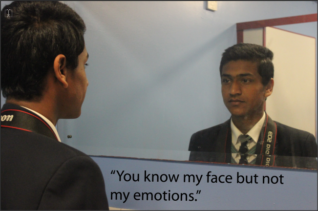
The quote "You know my face but not my emotions." suites the picture. First of all people only know how peoples face are but they could put a smile on their face and inside they could be emotional and scared and frightened and no one actually knows how you feel except you. So this picture will make people aware of peoples feelings and make them think before they do some thing to someone even if its a joke they might not like it but put a smile on their face.
In this shoot I tried to make a story of a person abused using face make paint and tried to make it real.
Shoot 3


My Worst Picture

I picked this picture for my worst picture, first of all you cant see where the picture was focused, there was no depth of field because it is out of focus everywhere. The right hand looks like paint from the angle. This picture wouldn't really make people aware of what is in this picture and people wouldn't wont to look at it because first thing people will think that it is a rubbish picture. The angle is okay but with the out of focus the bruises don't look realistic they look fake and look like paint.
My Best Picture
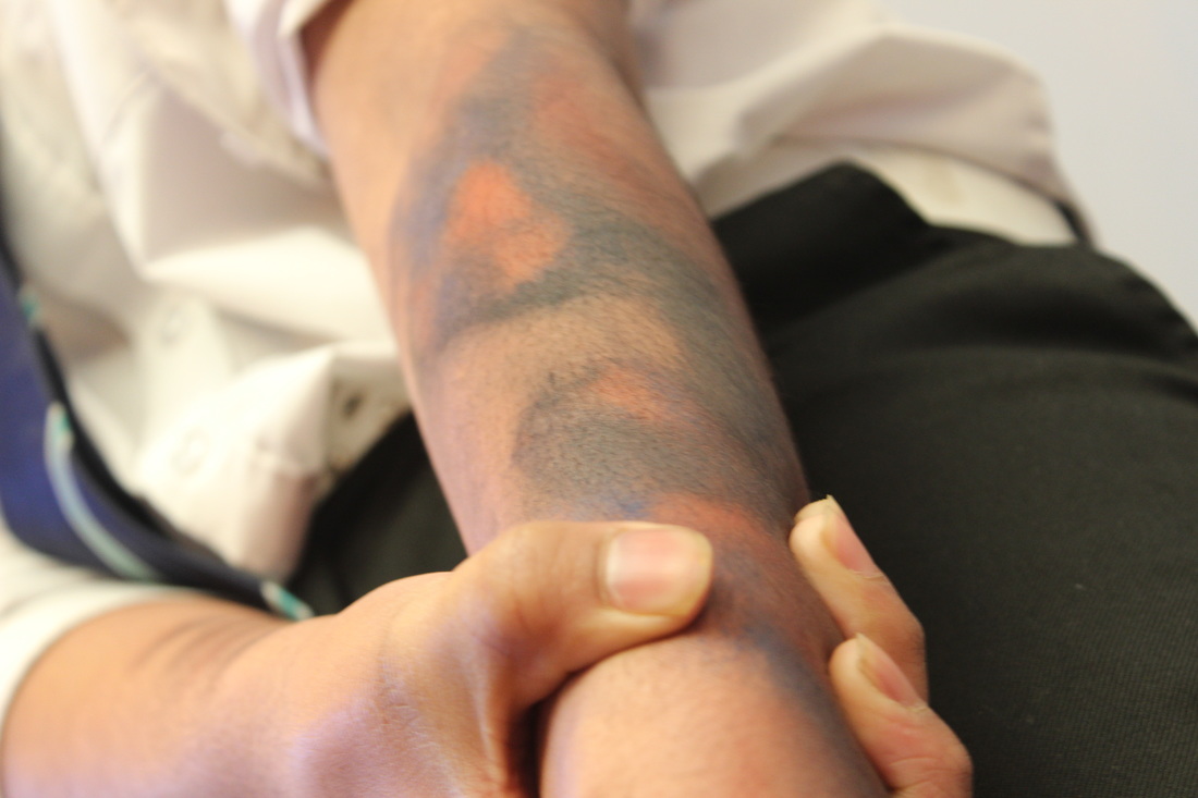
I picked this as my best picture, because it makes you think out of the box, and eye catching. The composition of the picture is good, I really like the angle of this picture, it shows everything and it shows how the person must be feeling, the bruise made from the face paint looks realistic on the right hand, and on the left hand it looks like someone has grabbed him really hard. The depth of field is small, focused only in small area, it is focused clear. It is not over exposed or under exposed. The way the person on this picture is holding his other hand makes it look like he is hurt. This picture will make people aware and make them think about what is in this picture, which is a picture of a person that has been abused and is showing his emotions and scars. The background isn't good for some of the pictures, because it is a negative thing and there is a lot of bright lighting, the background should be either white or black, but the lighting in this picture is good, the rule of third is used separating the picture in three sectors. The picture is captured clearly in worms eye view, showing the whole platform and from below. In my next shoot I now know what to improve on.
These shoots below I took at home, out of the school environment.
Shoot 4
In this shoot I tried to make a anti abuse campaign to show people a important message, that verbal abuse is still happening and it should stop!


First of all I took a picture of my hand and then a picture of me looking like I'm shouting. Then I cropped the background and put them both into one picture. I added a text saying "Words hurt just as much as Abuse!", because other wise without the text people wouldn't know what the picture is about.
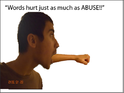
This is quite eye catching and looks a bit Surrealist, a person has a hand coming out of his hand. The picture is not under exposed or overexposed. There is a large depth of field, everything is focused and is clear. The composition of the picture is good, but there should be a person on the right side facing towards the fist to make it look like it is towards them and would make it more aware. The rule of thirds is not used but when I modify it then it will be used. The viewpoint is worms eye view, showing the whole platform. In the text abuse is all in capitals which is eye catching and will make people aware. This picture I captured and edited is important and people should be aware or how words effect others. The sizes of the props used are suitable sizes.


In this I modified the previous picture. I first of all took a picture of someone, I took different kind of face expressions and the emotional one looks the best. I then put the picture of the person into the other picture but then it didn't look realist, because it was cropped bad. I then did it again and cropped it perfectly.
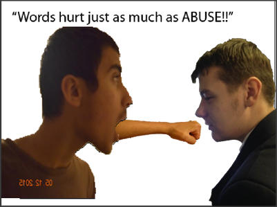
This is also eye catching and looks a bit Surrealist, a person has a hand coming out of his hand. The picture is not under exposed or overexposed. There is a large depth of field, everything is focused and is clear. The composition of the picture is good, using worms eye view, showing the whole platform. The rule of thirds has been used, splitting the picture into three sectors. There is a date on the picture because on my camera it shows the date when the picture has been captured. This picture is important and will make people aware of verbal abuse and that it is not okay to say negative things to people. The person shouting represents negativity coming out. The hand coming out of the persons mouth looks realistic and you cant tell that it has been edited. The victim on the right looks emotional which represents the victims out there that are having verbal abuse towards them. The scale of the props are suitable sizes.
Shoot 5


I first of all picked 2 pictures I thought was best, and then cropped them and edited them using pictures from the Internet making it look like a Campaign picture.
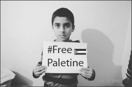
The picture is not under exposed or over exposed. The picture has been captured in worms eye view, showing the whole platform, and there is a large depth of field, focused everywhere clearly. The composition is good, there is nothing inappropriate. The rule of third has been used, splitting the picture into 3 sectors. However in this picture you can see the white of the paper. |
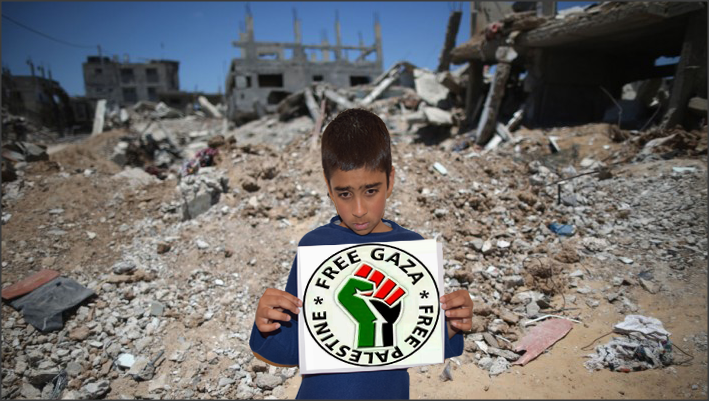
The lay out of this picture is good, I put it in a place where it looks like it has been damaged or bombed it makes it look better. The picture is not under exposed or over exposed. The picture has been captured in worms eye view, showing the whole platform, and there is a large depth of field, focused everywhere clearly.The rule of third has been used, splitting the picture into 3 sectors. |
Final Shoot
In this shoot I tried to make a picture of anti bombing Palestine campaign to show people a important message, that verbal abuse is still happening and it should stop! This shoot is just not for Palestine it is to any unfortunate Country that is getting bombed.


In this shoot I took pictures of a person holding a blank piece of paper and then I used the text on photoshop to say "#Free Palestine" and made it look like it was already on the paper. I then searched for a flag of Palestine and then I made it smaller to fit the paper.